page and panel flow
1 - THUMBNAILS
I’m occasionally asked how I create panel layouts and make my comic pages flow, so here’s my process! It starts with "thumbnails", very sketchy roughs of the finished pages. I stack them on top of each other whilst I’m drawing them so I can see how the webcomic will flow, but also get a clear idea of where the page breaks are.
Whilst I’m creating these I’m thinking on two different levels, first on the level of individual panels. I ask myself questions like:
What emotion do I want the reader to be feeling?
Is this the correct moment to create that emotion?
How can I frame the image in this panel to enhance that emotion, or reflect the moment?
How does the transition from the last panel feel? Abrupt? Gradual? Natural? Non-sequitur?
Does the feel of the transition enhance or undermine what I want the reader to feel?
(eg is an abrupt transition giving a tender moment an accidentally comedic pacing?)Am I leaving space for bubbles?
Second I’m thinking on the level of the page. I’m asking myself:
Do these panels work well together as an overall image, or are they clashing?
Is there a moment on this page that I want to come as a surprise, but could be glanced at before I want the reader to see it?
Are there any opportunities in the story to inform the shape or flow of the panels?
Are the decorative elements in my layouts making the story harder to read?
Here are a few examples of thumbnails next to finished pages. In this first page the answer to “Are there any opportunities in the story to inform the shape or flow of the panels?” was “A gathering crowd” and “The sound of bells calling them from the centre of the city”. This inspired the concentric circles coming from the image of the priests striking the bells which frame each panel of the crowd gathering. And although the meaning here is hidden in a quite decorative feature, you still get a general sense of what’s happening if you miss it.

In the next example, the answer to that question was “Getting lost in a crowd” “not being able to find the person you want to find”. In response, I removed the panel borders to create a jumble of bodies that you can get a little lost in, making sure to keep visual indicators of where the central character is, but not minding if the reader loses their way a little, knowing that we’ve already established that we’re in a crowded festival and getting a bit lost in it is exactly the feeling I want here:

In this last example, the answer to the question was “a feeling of being caged” and “a feeling of losing your sense of time and reality”. The solution I arrived at was to transition from a normal horizontal series of panels to having the bars of the cage warp and become panel borders, duplicating and overlaying moments in time to confuse the reader’s sense of how much time has passed. Again, we’ve established that she’s already in a cage and isn’t likely to go anywhere, so the confusion is deliberate and limited to what’s occurring from her point of view.

Of course, not every moment deserves a unique or unconventional layout - more often than not the answer is just “a series of clearly laid out panels to keep the conversation clear”. In these cases I use smaller decorative flourishes like circular panels or occasionally not using panel borders to keep the layouts fresh and direct the reader’s eye to key moments.
2 - BUBBLE AND PANEL FLOW RULES
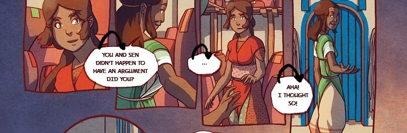
Once the thumbnails are done, I start to draw slightly more detailed roughs, focussing more closely on the layout, and adding lettering as early as possible so that I’m not left with a layout that has no space for lettering, or leads to a confusing bubble layout. I actually consider bubbles to be one of the most powerful ways to guide a readers eye round the page, and I have a set of rules for myself that I try never to break in order to keep the reading flow smooth:
1) Keep the panels-per-page to a minimum.
Less than 6 is ideal and as little as one or two panels is fine, but more can work if I need to support a lot of text or if precise pacing isn’t particularly important for that section of the story.

2) Keep the reading direction always going top-to-bottom and left-to-right.
I also try to include as little left-to-right as possible, since when scrolling a webcomic, the up-down axis is the most important for page flow. This also helps to reduce confusion for people who are used to reading from right-to-left.

This means that when placing speech bubbles, I never place my next speech bubble higher than my last, even if the panels are right next to each other.

3) Keep the flow of bubbles simple.
Once all the speech bubbles are placed, drawing a line through them in the intended reading order should produce a simple and easy-to-follow shape, starting at the top-left and ending at the bottom-right.

4) Use speech bubbles to bridge gaps between consecutive panels.
I make sure that bubbles create links between panels that should be read one after the other, to guide the eye from one to the next. I never bridge gaps between panels that aren't intended to be read one after the other.
5) Use the shape of the art and the direction of the characters to guide the reader's eye.
There are lots of opportunities to literally point the way to the next panel with your art. It could be the direction of a character’s gaze, or the direction of their movement, the shape of their body or the negative space around them. Remember that the reader’s eye is drawn to points of interest including speech bubbles, the characters’ faces and hands, or points of hard contrast like the line between a plain background and a complex character. Think of the page as containing pathways for the reader’s gaze, and guide it through areas of lower detail, stop or divert it with panel borders and speech bubbles, and encourage it with the direction of motion in a page.

3 - STITCHING THE PAGES
Finally, I turn the individual pages into a ribbon by extended the top and the bottom past the cropping point of the printed page in order to give me space and opportunities to merge the pages with each other. If I stick to the rules above, I very rarely end up with clashes where the page transition ruins the flow.

Once the pages that make up a ribbon are done and have this extra space above and below them, it's a relatively simple task to drop all of the pages into one very long canvas and position them so that it reads from top to bottom without apparent breaks. Ideally you can’t tell where the beginning and end of a page is, but for most page-to-page transitions, I don’t plan this exactly, it tends to occur naturally as a result of all of the previous rules.

And there we have it! I hope that's an insightful overview of how I make The Firelight Isle work for both web and print. If you’ve got any questions, please leave a comment, or support me on Patreon to see the whole process from beginning to end, and access rough versions of every page in the comic!